
Grab
Fast Rides, Fewer Taps

Overview
Grab has grown into one of Southeast Asia’s leading technology firms, serving over 185 million active users across ride-hailing and food delivery. I was fortunate to join the company right after its Series A funding round, when the design team was still in its earliest stages. This case study highlights one of my first projects at Grab, where I ran a two-week design sprint from problem framing to solution and that sprint-based, timeline-driven approach continues to shape how I work today.
Goal:
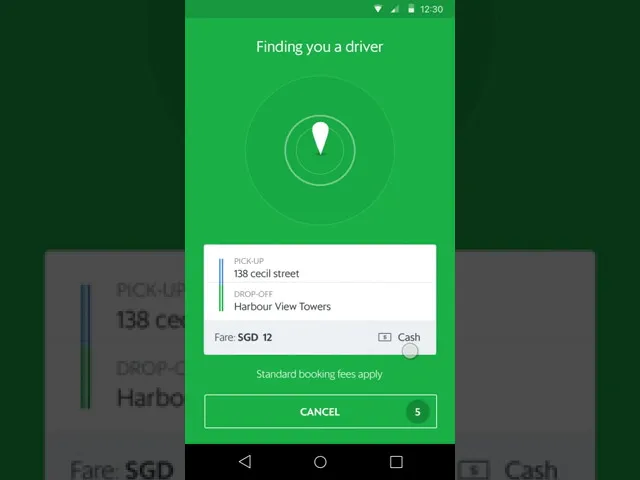
Decrease the time it takes to book a ride through the Grab app, leading to an increase in successful bookings.
Hypothesis:
By reducing the number of taps required for users to book, we can expedite the booking process.
Day 1
I used the 5E framework (Entice, Enter, Engage, Exit, Extend) to map the entire booking journey and pinpoint friction. I analyzed analytics and user feedback to focus on optimizing the initial screen after app launch.

I frequently use this framework as it offers a comprehensive view of the user experience and mental model from the moment they decide to open the app to its eventual closure. This method proves effective in identifying user pain points and determining which aspects of the experience truly need enhancement.

Based on the experience mapping, analytics data, previous user feedback and project scope, we agree to reduce the number of taps in the booking screen which is the first screen user see after the opening the app. I need to design a flow where this is features is not too cluttered and complex for the user to use, I roughly came up with a flow:

Day 2 & 3
On Days 2–3, I translated the flow into wireframes and evaluated features through the Kano model. This framework helped me distinguish between must-have basics, performance features that improve satisfaction as they’re optimized, and delighters that surprise users. By mapping ideas this way, I kept the booking flow simple, prioritized essentials, and avoided overwhelming riders with unnecessary complexity.

Option A: Recommended Cards
To do a card system where when we have data of the specific user we will show them a card asking them whether they are going to a specific place. They can either tap yes and straight away make a booking and or cancel it and goes back to the normal screen.

Option B: Single Screen
Include all available information on a single screen, allowing users to simply tap 'book now' to complete their reservation. If the drop-off location is changed, the pre-filled data will disappear and revert to.

Day 4
Team sync up
At Grab, we have a culture where every Thursday serves as a review day, allowing designers to present their project updates to their colleagues, engineers, product managers, and all other relevant team members. This facilitates the exchange of feedback and encourages constant improvement. As a designer, I find this process incredibly valuable in preventing complacency and the assumption that my design is the best ever. Occasionally, we also invite input from business stakeholders to gain additional insights.

The feedback was positive, and the majority agreed that this option was worth testing further. While there were minor concerns raised, the overall sentiment leaned toward moving forward, allowing us to validate the idea through user testing before making a final decision
Day 5
User Testing
Every Friday is designated for testing, which can involve real users or be conducted internally with colleagues from various departments, such as marketing. For this project, I opted for a combination of both real users and internal testing.
Our design team has a user researcher who typically collaborates with the project's lead designer on the testing approach. Since our focus is on wireframe testing and identifying potential flaws or pain points in the two proposed flows, I quickly prototype the wireframes to present to users.
For real user testing, I prefer employing a quick guerrilla research method, in which I gather random individuals outside the office to test the flows. At the end of the day, the team reconvenes to sync up on the results.

From the testing, it was evident that users struggled significantly with the single-card approach, stating that it was too confusing and felt like an error or announcement. Consequently, we agreed to proceed with the one-screen tap design, as it aligns more closely with the current flow.
Day 6 - 8
Usually, day 6 occurs on a Monday. In the morning, I assisted the user researcher, with whom I conducted tests, in uploading our findings to a wiki for the specific project.
For each project or feature that our company undertakes, the respective product owner creates a wiki using Confluence. This proves to be incredibly useful for tracking progress and allowing others to understand the project's purpose.
Subsequently, I addressed certain feedback, such as users feeling that the booking process was too rapid since there was no confirmation step, unlike the existing flow.

Day 8 - 9
On this day, I will begin prototyping the designs. There are three levels of prototyping that I use to determine which tools I'll be utilizing:
1 - LOW:
If there's a need to test a feature quickly or if the features don't alter the current flow, then I'll be using Marvelapp or Flinto for their swift hotspot transitions and camera recording integration during testing.
2 - MEDIUM:
If the feature entails some flow changes and animations are needed for improved User Experience, then I'll employ tools like Pixate or Flinto for their user-friendly animation utilities, allowing the prototype to resemble a genuine, functional product.
3 - HIGH:
If the feature requires actual data input (e.g., a user typing to search for a location) or needs to simulate a 100% authentic product, then I'll enlist the assistance of a prototyper or an engineer.
I've opted to treat this feature as a medium-level prototype, and I'll be using Flinto because our objective is to determine if the transitions for the new two flows make sense to users. There's no need to incorporate real data into the prototype, as it will contain the same data and content as the current flow. While prototyping, I prefer to collaborate with engineers to obtain their opinions and feedback on potential transitions or logic that can be implemented in iOS and Android, as each operating system has its strengths and weaknesses.
Day 10
Once more, every Friday serves as a testing day, and on these days, in collaboration with the user researcher, we will conduct guerilla user research combined with a blend of lab testing.
The user researcher has already invited several individuals to the office for this purpose. Other designers will seize this chance to examine their designs in progress, and the user researcher will arrange an appropriate timeframe for each of us to conduct our tests.

Before the day concludes, the team will gather for a brief recap of the findings to determine if we are sufficiently informed and confident to proceed with the current design, or if additional testing is necessary.
The test results were positive, with numerous users appreciating the approach due to its seamless experience and familiarity to the existing workflow, making it easy to adapt. Many users enjoyed the convenience of a single-screen interface and the ability to make a booking instantly with the tap of a button.
On the following Monday, I prepared the design assets for the engineers, utilizing Zeplin as a tool to help me do so because of its smooth integration with the sketch app I employ for my designs. Essentially, Zeplin streamlines the process by converting your design into redlines, PNGs, JPGs, etc., with a simple press of a button, significantly reducing the time spent.